After several
previous posts introducing item response theory (IRT), we are finally ready for
the analysis of a customer satisfaction data set using a rating scale. IRT can be multidimensional, and R is
fortunate to have its own package, mirt, with excellent documentation (R.Philip Chalmers). But, the presence of a
strong first principal component in customer satisfaction ratings is much a common finding
that we will confine ourselves to a single dimension, unless our data analysis
forces us into multidimensional space.
And this is where we will begin this post by testing the assumption of
unidimensionality.
Next, we must
run the analysis and interpret the resulting estimates. Again, R is fortunate that Dimitris
Rizopoulos has provided the ltm package.
We will spend some time discussing the results because it takes a couple
of examples before it becomes clear that rating scales are ordinal, that each
item can measure the same latent trait differently, and that the different
items differentiate differently at different locations along the individual
difference dimension. That is correct, I
did say “different items differentiate differently at different
locations along the individual difference
dimensions.”
Let me
explain. We are measuring differences
among customers in their levels of satisfaction. Customer satisfaction is not like water in a
reservoir, although we often talk about satisfaction using the reservoir or stockpiling
metaphors. But the stuff that brands provide
to avoid low levels of customer satisfaction is not the stuff that brands
provide to achieve high levels of customer satisfaction. Or to put it differently, that which upsets
us and creates dissatisfaction is not the same as that which delights us and
generates high positive ratings.
Consequently, items measuring the basics will differentiate among
customers at the lower end of the satisfaction continuum, and items that tap
features or services that exceed our expectations will do the same at the upper
end. No one item will cover the entire
range equally well, which is why we have a scale with multiple items, as we
shall see.
Overview of the Customer Satisfaction
Data Set
Suppose that
we are given a data set with over 4000 respondents who completed a customer
satisfaction rating scale after taking a flight on a major airline. The scale contained 12 ratings on a
five-point scale from 1=very dissatisfied to 5=very satisfied. The 12 ratings can be separated into three
different components covering the ticket purchase (e.g., online booking and
seat selection), the flight itself (e.g., seat comfort, food/drink, and on-time
arrival/departure), and the service provided by employees (e.g., flight
attendants and staff at ticket window or gate).
In the table
below, I have labeled the variables using their component names. You should note that all the ratings tend to
be concentrated in the upper two or three categories (negative skew), but this
is especially true for the purchase and service ratings with the highest means. This is a common finding as I have noted in
an earlier post.
|
Proportion Rating Each
Category on 5-Point Scale
|
Descriptive Statistics
|
||||||||
|
1
|
2
|
3
|
4
|
5
|
mean
|
sd
|
skew
|
||
|
Purchase_1
|
0.005
|
0.007
|
0.079
|
0.309
|
0.599
|
4.49
|
0.72
|
-1.51
|
|
|
Purchase_2
|
0.004
|
0.015
|
0.201
|
0.377
|
0.404
|
4.16
|
0.82
|
-0.63
|
|
|
Purchase_3
|
0.007
|
0.016
|
0.137
|
0.355
|
0.485
|
4.30
|
0.82
|
-1.09
|
|
|
Flight_1
|
0.025
|
0.050
|
0.205
|
0.389
|
0.330
|
3.95
|
0.98
|
-0.86
|
|
|
Flight_2
|
0.022
|
0.055
|
0.270
|
0.403
|
0.251
|
3.81
|
0.95
|
-0.60
|
|
|
Flight_3
|
0.024
|
0.053
|
0.305
|
0.393
|
0.224
|
3.74
|
0.94
|
-0.52
|
|
|
Flight_4
|
0.006
|
0.022
|
0.191
|
0.439
|
0.342
|
4.09
|
0.81
|
-0.66
|
|
|
Flight_5
|
0.048
|
0.074
|
0.279
|
0.370
|
0.229
|
3.66
|
1.06
|
-0.63
|
|
|
Flight_6
|
0.082
|
0.151
|
0.339
|
0.259
|
0.169
|
3.28
|
1.16
|
-0.23
|
|
|
Service_1
|
0.002
|
0.008
|
0.101
|
0.413
|
0.475
|
4.35
|
0.71
|
-0.91
|
|
|
Service_2
|
0.004
|
0.013
|
0.091
|
0.389
|
0.503
|
4.37
|
0.74
|
-1.17
|
|
|
Service_3
|
0.009
|
0.018
|
0.147
|
0.422
|
0.405
|
4.19
|
0.82
|
-0.97
|
|
And How Many Dimensions Do You See in
the Data?
We can see
the three components in the correlation matrix below. The Service ratings form the most coherent
cluster, followed by Purchase and possibly Flight. If one were looking for factors, it seems
that three could be extracted. That is,
the three service items seem to “hang” together in the lower right-hand
corner. Perhaps one could argue for a similar
clustering among the three purchase ratings in the upper left-hand corner. Yet, the six Flight variables might cause
us to pause because they are not that highly interrelated. But they do have lower correlations with the
Purchase ratings, so maybe Flight will load on a separate factor given the
appropriate rotation. On the other hand,
if one were seeking a single underlying dimension, one could point to the uniformly
positive correlations among all the ratings that fall not that far from an average value of 0.39. Previously, we have referred to this pattern
of correlations as a positive manifold.|
P_1
|
P_2
|
P_3
|
F_1
|
F_2
|
F_3
|
F_4
|
F_5
|
F_6
|
S_1
|
S_2
|
S_3
|
|
|
Purchase_1
|
|
0.43
|
0.46
|
0.34
|
0.30
|
0.33
|
0.39
|
0.28
|
0.25
|
0.39
|
0.40
|
0.37
|
|
Purchase_2
|
0.43
|
0.46
|
0.37
|
0.43
|
0.33
|
0.36
|
0.31
|
0.34
|
0.43
|
0.40
|
0.42
|
|
|
Purchase_3
|
0.46
|
0.46
|
|
0.29
|
0.36
|
0.34
|
0.41
|
0.29
|
0.30
|
0.38
|
0.44
|
0.45
|
|
Flight_1
|
0.34
|
0.37
|
0.29
|
|
0.37
|
0.43
|
0.37
|
0.45
|
0.35
|
0.44
|
0.44
|
0.40
|
|
Flight_2
|
0.30
|
0.43
|
0.36
|
0.37
|
0.42
|
0.38
|
0.35
|
0.45
|
0.40
|
0.39
|
0.36
|
|
|
Flight_3
|
0.33
|
0.33
|
0.34
|
0.43
|
0.42
|
0.52
|
0.38
|
0.40
|
0.33
|
0.38
|
0.35
|
|
|
Flight_4
|
0.39
|
0.36
|
0.41
|
0.37
|
0.38
|
0.52
|
0.35
|
0.35
|
0.35
|
0.37
|
0.37
|
|
|
Flight_5
|
0.28
|
0.31
|
0.29
|
0.45
|
0.35
|
0.38
|
0.35
|
0.38
|
0.37
|
0.39
|
0.40
|
|
|
Flight_6
|
0.25
|
0.34
|
0.30
|
0.35
|
0.45
|
0.40
|
0.35
|
0.38
|
|
0.40
|
0.38
|
0.35
|
|
Service_1
|
0.39
|
0.43
|
0.38
|
0.44
|
0.40
|
0.33
|
0.35
|
0.37
|
0.40
|
|
0.66
|
0.51
|
|
Service_2
|
0.40
|
0.40
|
0.44
|
0.44
|
0.39
|
0.38
|
0.37
|
0.39
|
0.38
|
0.66
|
0.70
|
|
|
Service_3
|
0.37
|
0.42
|
0.45
|
0.40
|
0.36
|
0.35
|
0.37
|
0.40
|
0.35
|
0.51
|
0.70
|
|
Do we have
evidence for one or three factors? Perhaps the scree plot can help. Here we see a substantial first principal
component accounting for 44% of the total variation and five times larger than
the second component. And then we have a
second and third principal component with values near one. Are these simply scree (debris at the base of
a hill) or additional factors needing only the proper rotation to show
themselves?

The bifactor model helps to clarify the structure underlying these correlations. The uniform positive correlation among all
the ratings is shown below in the sizeable factor loadings from g (the general
factor). The three components, on the
other hand, appear as specific factors with smaller loadings. And how should we handle Service_2, the only
item with a specific factor loading higher than 0.4? Service_2 does seem to have the highest
correlations across all the items, yet it follows the same relative pattern as
the other service measures. The answer
is that Service_2 asks about service at a very general level so that at least
some customers are thinking not only about service but about their satisfaction
with the entire flight. We need to be
careful not to include such higher-order summary ratings when all the other
items are more concrete. That is, all
the items should be written at the same level of generality.

IRT would prefer
the representation in the bifactor model and would like to treat the three
specific components as “nuisance” factors.
That is, IRT focuses on the general factor as a single underlying latent
trait (the foreground) and ignores the less dramatic separation among the three
components (the background). Of course,
there are alternative factor representations that will reproduce the
correlation matrix equally well. Such
are the indeterminacies inherent in factor rotations.
The Graded Response Model (grm)
This section
will attempt a minimalist account of the fitting of the graded response data to
these 12 satisfaction ratings. As with
all item response models, the observed item response is a function of the
latent trait. In this case, however, we have
a rating scale rather than a binary yes/no or correct/incorrect; we have a
graded response between very dissatisfied and very satisfied. The graded response model assumes only that
the observed item response is an ordered categorical variable. The rating values from one to five indicate
order only and nothing about the distance between the values. The rating scale is treated as ordered but
not equal interval.
As a statistical
equation, the graded response model does not make any assertions concerning how
the underlying latent variable “produces” a rating for an individual item. Yet, it will help us to understand how the
model works if we speculate about the response generation process. Relying on a little introspection, for all of
us have completed rating scales, we can imagine ourselves reading one of these
rating items, for example, Service_2.
What might we be thinking? “I’m
not unhappy with the service I received; in fact, I am OK with the way I was
treated. But I am reluctant to use the top-box
rating of five except in those situations where they go beyond my
expectation. So, I will assign Service_2
a rating of four.” You should note that
Service_2 satisfaction is not the same as the unobserved satisfaction
associated with the latent trait.
However, Service_2 satisfaction ought to be positively correlated with
latent satisfaction. Otherwise, the
Service_2 rating would tell us nothing about the latent trait.

Everything we
have just discussed is shown in the above figure. The x-axis is labeled “Ability” because IRT
models saw their first applications in achievement testing. However, in this example you should read “ability”
as latent trait or latent customer satisfaction. The x-axis is measured in standardized units,
not unlike a z-score. Pick a value on
the x-axis, for example, the mean zero, and draw a perpendicular line at that
point. What rating score is an average respondent
with a latent trait score equal to zero likely to give? They are not likely to assign a “1” because
the curve for 1 has fallen to probability zero.
The probabilities for “2” or “3” are also small. It looks like “4” or “5” are the most likely
ratings with almost equal probabilities of approximately one half. It should be clear that unlike our
hypothetical rater described in the previous paragraph, we do not see any
reluctance to use the top-box category for this item.
Each item has
its own response category characteristic curve, like the one shown above for
Service_2, and each curve represents the relationship between the latent trait
and the observed ratings. But what
should we be looking for in these curves?
What would a “good” item look like, or more specifically, is Service_2 a
good item? Immediately, we note that the
top-box is reached rather “early” along the latent trait. Everyone above the mean has a greater
probability of selecting “5” than any other category. It should be noted that this is consistent
with our original frequency table at the beginning of this post. Half of the respondents gave Service_2 a
rating of five, so Service_2 is unable to differentiate between respondents at
the mean or one standard deviation above the mean or two standard deviations above
the mean.
Perhaps we
should look at a second item to help us understand how to interpret item
characteristic curves. Flight_6 might be
a good choice for a second item because the frequencies for Flight_6 seem to be
more evenly spread out over the five category values: 0.082, 0.151, 0.339,
0.259, and 0.196.
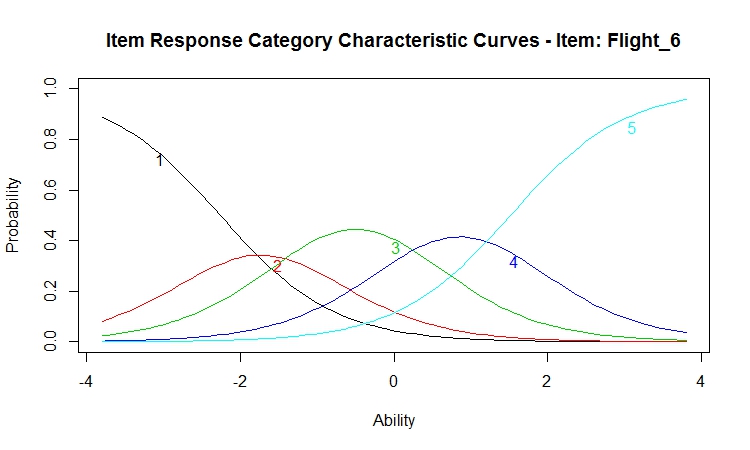
And that is
what we see, but with a lot of overlapping curves. What do I mean? Let us draw our perpendicular at zero again
and observe that an average respondent is only slightly more likely to assign a
“3” than a “4” with some probability that they would give instead a “2” or a
“5.” We would have liked these curves to
have been more "peaked" and with less overlap.
Then, there would be much less ambiguity concerning what values of the
latent trait are associated with each category of the rating scale. In order to “grasp” this notion, imagine grabbing
the green “3” curve at its highest point and pulling it up until the sides move
closer together. Now, there is a much
smaller portion of the latent trait associated with a rating of 3. When all the curves are peaked and spread
over the range of the latent trait, we have a “good” item.
Comparing the Parameter Estimates from
Different Items
Although one
takes the time to examine carefully the characteristic curve for each item,
there is an easier method for comparing items.
We can present the parameter estimates from which these curves were
constructed, as shown below.
Coefficients:
|
Extrmt1
|
Extrmt2
|
Extrmt3
|
Extrmt4
|
Dscrmn
|
|
Purchase_1
|
-3.72
|
-3.20
|
-1.86
|
-0.39
|
1.75
|
|
Purchase_2
|
-3.98
|
-3.00
|
-1.11
|
0.29
|
1.72
|
|
Purchase_3
|
-3.57
|
-2.85
|
-1.41
|
0.01
|
1.73
|
|
Flight_1
|
-2.87
|
-2.07
|
-0.88
|
0.58
|
1.64
|
|
Flight_2
|
-3.08
|
-2.14
|
-0.64
|
0.95
|
1.56
|
|
Flight_3
|
-3.05
|
-2.15
|
-0.50
|
1.11
|
1.53
|
|
Flight_4
|
-3.94
|
-2.87
|
-1.17
|
0.55
|
1.58
|
|
Flight_5
|
-2.53
|
-1.79
|
-0.46
|
1.08
|
1.52
|
|
Flight_6
|
-2.26
|
-1.21
|
0.21
|
1.51
|
1.35
|
|
Service_1
|
-3.46
|
-2.76
|
-1.46
|
0.02
|
2.50
|
|
Service_2
|
-2.91
|
-2.33
|
-1.39
|
-0.07
|
3.13
|
|
Service_3
|
-2.86
|
-2.32
|
-1.17
|
0.24
|
2.45
|
|
1 vs. 2-5
|
1-2 vs. 3-5
|
1-3 vs. 4-5
|
1-4 vs. 5
|
Our item
response categories characteristic curves for Flight_6 show the 50% inflection
point only for the two most extreme categories, ratings of one and five. The remaining curves are constructed by
subtracting adjacent categories. Before
we leave, however, you must notice that the cutpoints for Service_2 all fall
toward the bottom of the latent trait distribution. As we noted before, even the cutpoint for the
top-box is not quite zero because more than half the respondents gave a rating
of five.
What about
the last column with the estimates of the discrimination parameters? We have already noted that there is a benefit
when the characteristics curves for each of the category levels have high peaks. The higher the peaks, then the less overlap
between the category values and the greater the discrimination between the
rating scores. Thus, although the
ratings for Flight_6 span the range of the latent trait, these curves are
relatively flat and their discrimination is low. Service_2, on the other hand, has a higher
discrimination because its curves are more peaked, even if those curves are
concentrated toward the lower end of the latent trait.
“So far, so
good,” as they say. We have concluded
that the items have sufficiently high correlation to justify the estimate of a
single latent trait score. We have fit
the graded response model and estimated our latent trait. We have examined the item characteristic
curves to assess the relationship between the latent trait and each item
rating. We were hoping for items with
peaked curves spread across the range of the latent trait. We were a little disappointed. Now, we will turn to the concept of item
information to discover how much we can learn about the latent trait from each
item.
We remember
that the observed ratings are indicators of the latent variable, and each item
provides some information about the underlying latent trait. The term information is used in IRT to
indicate the reciprocal of the precision with which the latent trait is
measured. Thus, a high information value
is associated with a small standard error of measurement. Unlike classical test theory with its single
value of reliability, IRT does not assume that
measurement precision is constant for all levels of the latent trait. The figure below displays how well each item
performs as a function of the latent trait.
What can we
conclude from this figure? First, as we
saw at the beginning of the post when we examined the distributions for the
individual items, we have a ceiling effect with most of our respondents using
only the top two categories of our satisfaction scale. This is what we observe from our item
information curves. All the curves begin
to drop after the mean (ability = 0). To
be clear, our latent trait is estimated using all 12 items, and we get better
differentiated from the 12 items than from any item by itself. However, let me add that almost 5% of the
respondents gave ratings of five to every item and obtained the highest
possible score. Thus, we see a ceiling
effect for the latent trait, although a smaller ceiling effect than that for
the individual items. Still we could
have benefited from the inclusion of a few items with lower mean scores that
were measuring features or services that are more difficult to deliver.
The green curve
yielding the most information at low levels of latent trait is our familiar
Service_2. Along with it are Service _1
(red) and Service_3 (blue). The three
Purchase ratings are labeled 1, 2, and 3.
The six ratings of the Flight are the only curves providing any
information in the upper ranges of the latent variable (numbered 4-9). All of this is consistent with the item
distributions. The means for all the
Purchase and Service ratings are above 4.0.
The means for the Flight items are not much better, but most of these
means are below 4.0.
Summary
So that is
the graded response model for a series of ratings measuring a single underlying
dimension. We wanted to be able to
differentiate customers who are delighted from those who are disgusted and
everyone in between. Although we often
speak about customer satisfaction as if it were a characteristic of the brand
(e.g., #1 in customer satisfaction), it is not a brand attribute. Customer satisfaction is an individual
difference dimension that spans a very wide range. We need multiple items because different
portion of this continuum have different definitions. It is failure to deliver the basics that
generates dissatisfaction, so we must include ratings tapping the basic
features and services. But it is meeting
and exceeding expectation that produces the highest satisfaction levels. As was clear from the item information
curves, we failed to include such more difficult to deliver items in our battery of ratings.
Appendix with R-code
library(psych)
describe(data) # means and SDs for data
file with 12 ratingscor(data) # correlation matrix
scree(data, factors=FALSE) # scree plot
omega(data) # runs bifactor model
library(ltm)
descript(data) # runs frequency
tables for every itemfit<-grm(data) # graded response model
fit # print cutpoints and discrimination
plot(fit) # plots
item category characteristic curves
plot(fit,
type="IIC") #
plots item information curves
# next two
lines calculate latent trait scores and assign them to variable named trait
pattern<-factor.scores(fit,
resp.pattern=data)trait<-pattern$score.dat$z1
Dear Joel,
ReplyDeleteI find your posts on Customer Satisfaction (CS) and IRT models very interesting. I'm a researcher currently working on the very same topic, specifically I'm employing multidimensional IRT (MIRT) models (compensatory as for now) to CS data. A paper is in review, that discuss interpretation and use of 1PL-2PL-M2PL models for CS analyses, focusing on item parameters and their possible role in improvements planning from the service provider's side.
At the moment I'm working on a multidimensional GPCM, do you have any advice/related paper to give/suggest me?
Kindest regards,
Federico Andreis, PhD
Università degli Studi di Milano
federico.andreis@unimi.it
Thank you for your kind comment. Perhaps I too quickly dismissed MIRT in the first paragraph of my post. However, the reference to Phil Chalmers' mirt R package is my recommendation as the place to start. The generalized partial credit model is one of the IRT models that Phil covers in some detail.
DeleteHave you considered the extended Rasch model (e.g., the eRm r package)? I am making this suggestion because of your interest in the role of item parameters in improving services. I have found that specific factors from the bifactor model can be associated with mean level differences in the item ratings (e.g., the flight attributes tend to be rated lower than the service attributes). In such cases, diagnostic information comes from explaining item difficulty and not from the multidimensionality of the latent trait. A battery of customer satisfaction ratings can be sorted into categories not unlike the cells of an ANOVA design. The eRm is designed to decompose item difficulty and thus provide diagnostic information.
Thanks for your answer, Joel!
ReplyDeleteI have used the eRm package but back when I was working on different topics, and just for the sake of estimation double-checks. I will get back to it.
I've noticed (and later found in the literature, see "Takane, de Leeuw, 1987. On the relationship between item response theory and factor analysis of discretized variables" a confirmation thereof), a strong correlation between factor analysis loadings and discriminant parameters in IRT models. This helped providing more insight and a point of contact and comparison with classic methods employed in CS.
I'm studying the mirt package by Phil Chalmers right now, and see if it can help speeding up estimation (my MHwithinGibbs algorithms are way less efficient than MH-RM, I fear) and providing a nice way to obtain diagnostics.
Hey Federico,
DeleteThe current version of mirt on CRAN is terribly slow at estimating the gcpm, however the development version on github is approximately 40x faster for the EM and about 15-20x faster for the MH-RM, so I'd recommend installing from source (I won't be releasing a new version till February).
Also, mirt now has the ability to estimate similar models to the eRm package (e.g., LLTM) for modelling item difficulties directly, but also allows for estimating the item level slopes and person level covariates. This is done through the new mixedmirt() function, which at some point in time will also support multilevel IRT models (hence the inspiration for the name, 'mixed effects mirt'). Hope that helps, and all the best!
Phil
P.S. Thanks for the publicity @Joel! Very kind of you.
Thanks a lot, Phil!
DeleteAnd may I say, it's a pleasure to get in touch with you, I do really appreciate your work!
I'll check out the github version..
(how did you get it to be 40x and 15/20x faster? mere code optimization? or did you re-write the routines in a lower language?)
/f
Yes, I moved the computation of the Hessian and gradients into C++ code via Rcpp, which was the main bottle neck. That's actually how a lot of mirt is sped up, where about 5% of the package code is coded in C++ while the rest is in R for convenience and maintenance. I think it's a great 1-2 punch, and the way Rcpp (and family) is set up is really awesome and convenient to work with in package development. Cheers!
DeletePhil
The information written on Customer Satisfaction is good and IRT models very interesting. I like your way to present the information in sequence and in informative way. Thanks for sharing this...Event Planning Ideas
ReplyDelete