Pages

Tuesday, January 22, 2013

Reducing Respondent Burden: Item Sampling

You received confirmation this morning.  Someone made a mistake programming that battery of satisfaction ratings on your online survey.  Instead of each respondent rating all 12 items using a random rotation, only six randomly selected items were shown to any one respondent.  As a result, although you have ratings for all 12 items, no single respondent gave ratings on more than six items.

But all is not lost!  Your remember hearing about a technique from you college psychometrics class that did exactly the same thing.  Item sampling was suggested by Lord and Novick in their classic 1968 text introducing item response theory (chapter 11).  If the focus is the school (brand) and not individual students (customers), we can obtain everything we need by randomly selecting only some proportion of the items to be given to each examinee (respondent).

Suppose that a brand is concerned about how well it delivers on a sizable number of different product features and services.  The company is determined to track them all, possibly in order to maintain quality control.  Obviously, the brand needs enough respondent ratings for each item to yield stable estimates at the brand level, but the individual respondent is largely irrelevant, except as a means to an end.  To accomplish their objective, no item can be deleted from the battery, but no respondent needs to rate them all.

One might object that we still require individual-level data if we wish to estimate the parameters of a regression model that will tells us, for example, the effect of customer satisfaction on important outcomes such as customer retention.  But do we really need all 12 satisfaction ratings in the regression model?  Does each rating provide irreplaceable information about the individual customer so that removing any one item leaves us without the data we need?  Or, is there enough redundancy in the ratings that little is lost when a respondent rates only a random sample of the items?

Graded Response Model to the Rescue

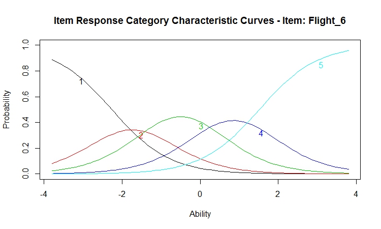
Item response theory provides an answer.  Specifically, the graded response model introduced in a prior post, Item Response Modeling of Customer Satisfaction, will give us an estimate of what information we lose when items are sampled.  As you might recall from that post, we had a data set with over 4000 respondents who had completed a customer satisfaction scale after taking a flight with a major airline.  Since most of our studies will not have data from so many respondents, we can randomly select a small number of observations and work with a more common sample size.  If we wish to obtain the same sample every time, we will need to set the random seed.  The original 4000+ data set was called data. The R function sample randomly selects without replacement 500 rows.

set.seed(12345)
sample <- data[sample(1:nrow(data), 500, replace=FALSE),]

Now, we can rerun the graded response model with 500 random observations.  But, we remember that the satisfaction ratings were highly skewed so that we cannot be certain that all possible category levels will be observed for all 12 ratings given we now have only 500 respondents.  For example, the ltm package would generate an error message if no one gave a rating of "one" to one of the 12 items.  Following the example on R wiki (look under FAQ), we use lapply to encode the variables of the data frame as factors.

sample.new <- sample
sample.new[] <- lapply(sample, factor)

With the variables as factors, we need not worry about receiving an error, and we can run the graded response model using the ltm package as we did in the previous post.

library(ltm)
fit <- grm(sample.new)
pattern <- factor.scores(fit, resp.pattern=sample.new)
trait <- pattern$score.dat$z1

The factor.scores function does the work of calculating the latent trait score for satisfaction.  It creates an object that we have called pattern in the above code.  The term "pattern" was chosen because the object contains all the ratings upon which the latent score was based.  That is, factor.scores outputs an object with the response pattern and the z-score for the latent trait.  We have copied this z-score to a variable called trait.

The next step is to sample some portion of the items and rerun the graded response model with the items not sampled set equal to the missing value NA.  In this way we are able to recreate the data matrix that would have resulted had we sampled items from the original questionnaire.  There are many ways to accomplish such item sampling, but I find the following procedure to be intuitive and easy to explain. 

set.seed(54321)
sample_items <- NULL
for (i in 1:500) {
  sample_items <- rbind(simple_items, sample(1:12,12))
}
sample_test <- sample
sample_test[sample_items>6] <- NA

The above R code creates a new matrix called sample_items that is the same size as the data file in the data frame called sample (i.e., 500 x 12).  Each row of sample_items contains the numbers one through 12 in random order.  In order to randomly sample six of the 12 items, I have set the criterion for NA assignment as sample_items>6.  Had I wanted to sample only three items, I would have set the criterion to sample_items>3.

Once again, we need to recode the variables to be factors in order to avoid any error messages from the ltm package when one or more items have one or more category levels with no observations.  Then, we rerun the graded response model with half the data missing.

sample_test.new <- sample_test
sample_test.new[] <- lapply(sample_test, factor)

fit_test<-grm(sample_test.new)
fit_sample_test<-grm(sample_test,new)
pattern_sample_test<-factor.scores(fit_sample_test, resp.pattern=sample_test.new)
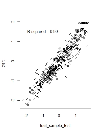
trait_sample_test<-pattern_sample_test$score.dat$z1

This is a good time to pause and reflect.  We started with the belief that our 12 satisfaction ratings were all measuring the same underlying latent trait.  They may be measuring some more specific factors, in addition to the general factor, as we saw from our bifactor model in the prior post.  But clearly, all 12 items are tapping something in common, which we are calling latent customer satisfaction.

Does every respondent need to rate all 12 items in order for us to estimate each respondent's level of latent customer satisfaction?  How well might we do if only half the items were randomly sampled?  We now have two estimates of our latent trait, one from each respondent rating all 12 items and one with each respondent rating a one-half item sampling.  A simple regression equation should tell us the relationship between the two estimates.


Item sampling appears to be a promising approach.  We have cut the number of items in half, and yet we are still able to recover each respondent's latent trait score with a relatively high level of accuracy.  Of course, there is nothing to stop us from sampling fewer than 6 items.  For example, the R-squared is 0.72 with an item sampling of only three of the 12 items.  However, one might need to "fine-tune" the grm function by adding start.val="random" or running the analysis more than once.  One should also note that the ltm package offers more than one method for estimating factor scores.  Unfortunately, it would take us too far afield to discuss the pros and cons of each of the three estimation procedures offered by factor.score for grm objects.

Caveats and Alternatives

The objectives for this post were somewhat limited.  Primarily, I wanted to reintroduce "item sampling" to the marketing research and R communities.  Graded response modeling in the ltm package seemed to be the most direct way of accomplishing this.  First, I believed that this approach would create the least confusion.  Second, it provided a good opportunity for us to become more familiar with the ltm package and its capabilities.  However, we need to be careful.

As the amount of missing value increases, greater burdens are placed on any estimation procedure, including the grm and factor.scores functions in the ltm package.  Although as we saw in this example, ltm had no difficulty handling item sampling using a sampling ratio of 0.5, but we will need to exercise care as the sampling ratio falls under one half.  As you might expect, R is full of missing value estimation packages (see missing data under multivariate task view).  Should we estimate missing values first and then run the graded response model?  Or, perhaps we should collect a calibration sample with these respondents completing all the ratings?  The graded response model estimates from the calibration sample would be used to calculate latent trait scores from the item sampling data for all future respondents.

These are all good questions, but first we must think outside the common practice of requiring everyone to complete every rating.  It is necessary to have all the respondents rate all the items only when each item provides unique information.  We may seldom find ourselves in such a situation.  More often, items are added to the questionnaire for what might be called "political" reasons (e.g., as a signal to employees that the company values the feature or service rated or to appease an important constituency in the company).  Item sampling provides a doable compromise allowing us to please everyone and reduce respondent burden at the same time.


Thursday, January 17, 2013

If SPSS can factor analyze MaxDiff scores, why can't R?

Answer:  The variance-covariance matrix containing all the MaxDiff scores is not invertible.  R tells you that, either with an error message or a warning.  SPSS, at least earlier versions still in use, runs the factor analysis without comment.

I made two points in my last post.  First, if you want to rank order your attributes, you do not need to spend $2,000 and buy Sawtooth's MaxDiff.  A much simpler data collection procedure is available.  You only need to list all the attributes and ask respondents to indicate which attribute is the best on the list.  Then you repeat the same process after removing the attribute just selected as best.  The list gets shorter by one each time, and in the end you have a rank ordering of all the attributes.  But remember that the resulting ranks are linearly dependent because they sum to a constant, which was my second point in the prior post.  This same dependency can be seen in the claimed "ratio" scores from a MaxDiff.  The scores from a MaxDiff sum to a constant, so they are also dependent and cannot be analyzed as if they were not.  Toward the end of that previous post, I referred you to the r package composition for a somewhat technical discussion of the problem and a possible solution.

So you can image my surprise when I received an email with the output from an SPSS factor analysis of MaxDiff scores.  Although the note was polite, questions were raised regarding my assertion that MaxDiff scores are linearly dependent.  Surely, if they were, the correlation matrix could not be inverted and factor analysis would not be possible.

I asked that the sender run a multiple regression using SPSS with the MaxDiff scores as the independent variables.  And they spent me back the output with all the regression coefficients, except for one excluded MaxDiff score.  My reputation was saved.  On its own, SPSS had removed one of the variables in order to invert (X'X).  Since the sender had included the SPSS file as an attachment, I read it into R and tried to run a factor analysis using one of the build-in R functions.  The R function factanal, which performs maximum-likelihood factor analysis, returned an error message, "System is computationally singular."  I tried a second factor analysis using the psych package.  The principal function from the psych package was more accommodating.  However, it gave me a clear warning, "matrix was not positive definite, smoothing was done."

This is an example of why I am so fond of R.  Revelle, the author of the psych package, has added a function called cor.smooth to deal with correlation matrices containing teterachoric or polychoric coefficients or coefficients calculated from pairwise deletion.  Such correlation matrices are not always positive definite.  You can type ?cor.smooth after loading the psych package to get the details, or you can type cor.smooth without parameters to obtain the underlying R code.  His function principal gives me the warning, smoothes the correlation matrix, and then produces output with results almost identical to that from SPSS.  Had I been more careful initially, I would have noticed that the last eigenvalue from the SPSS results seemed a little small, 2.776E-17.  Is this just a rounding error?  Has it been fixed in later versions of SPSS?

Now what?  How am I to analyze these MaxDiff scores?  I cannot simply pretend that the data collection procedure did not create spurious negative correlations among the variables.  As we have seen with the regression and the factor analysis, I cannot perform any multivariate analysis that requires the covariance matrix to be inverted.  And what if I wanted to do cluster analysis?  The constraint that all the scores sum to a constant creates problems for all statistical analyses that assume observations lie in Euclidian space.  One could consider this to be an unintended consequence of forcing tradeoffs when selecting the best and the worst of a small set of attributes.  But regardless of the cause, we end up with models that are misspecified and estimates that are biased.

As an alternative, we could incorporate the constant sum constraint and move from a Euclidean to a simplex geometry, as suggested by the r package composition.  Perhaps the best way to explain simplex geometry is to start with two attributes, A and B, whose MaxDiff scores sum to 100.  Although there are two scores, they do not span a two-dimensional Euclidean space since A + B = 100.  If one thinks of the two-dimensional Euclidean space as the floor of a room, MaxDiff restricts our movement to one dimension.  We can only walk the line between always A (100, 0) and always B (0, 100).  Similar restrictions apply when there are more than two MaxDiff attributes.

In a three-dimensional Euclidean space one can travel unrestricted in any direction.   However, in a three-dimensional simplex space one can travel freely only within a two-dimensional triangle where each vertex represents the most extreme score on each attribute.  For example, a score of 80 on the first attribute leaves only 20 for the other two attributes to share.  The figure below shows what our simplex would look like with only three MaxDiff scores and our most extreme score for the each attribute at the vertices.

This simplex plot is also known as a ternary plot.  You should note that the three axes are the sides of the triangle.  They are not at right angles to each other because the dimensions are not independent.  It takes a little while to get familiar with reading coordinates from the plot because we tend to think "Euclidean" about our spaces.  If you start at the apex labeled with a 1, you will be at the MaxDiff pattern (100, 0, 0).  Now, jump to the base on the triangle.  Any observation along the base has a MaxDiff score of zero for the first attribute.  The blue lines drawn parallel to the base are the coordinates for the first attribute. 

Next, find the vertex labeled 2; this is the MaxDiff pattern (0, 100, 0).  If you jump to the side of the triangle opposite this vertex, you will be at a second MaxDiff score of zero.  All the lines parallel to the side opposite the vertex #2 are the coordinates for second MaxDiff score.  You should remember that the vertex has a score of 100, so that the marking you should be reading are those along the base of the triangle that gradually decrease from 100 (i.e., 90 is closest to the 2nd vertex).  You interpret the third attribute in the same way.

We stop plotting with this figure.  In four-dimensions the simplex plot looks like a tetrahedron, and no one wants to read coordinates off a tetrahedron.

The r package composition outlines an analysis consistent with the statistical properties of our measures.  It would substitute log ratios for the MaxDiff scores.  One even has some flexibility over what is the base for that log ratio.  As I noted in the last post, Greenacre has created some interesting biplots from such data.  You could think about cluster analysis within Greenacre's biplots.  Or, we could avoid all these difficulties by not using MaxDiff or ranking tasks to collect our data.  Personally, I find Greenacre's approach very intriguing, and I would pursue it if I believed that the MaxDiff task provided meaningful marketing data.

Perhaps I should provide an example of the point that I am trying to make.  The task in choice modeling corresponds to a real marketplace event.  I stand in front of the retail shelf and decide which pasta to buy for dinner.  There was a time in my research career when I only used rating-based conjoint for individual-level analysis with purchase likelihood as the dependent variable.  But I was motivated to substitute choice-based conjoint analysis because I found convincing research demonstrating that the cognitive processing underlying choice among alternatives was different than the cognitive processing underlying the purchase likelihood rating.  Choice modeling mimics the marketplace, so I learned how to run hierarchical Bayes choice models (see r package bayesm).

There are times and situations in the marketplace where tradeoffs must be made by consumers.  Selecting only one brand from many different alternatives is one example.  Deciding to fly rather than drive or take the train is another example.  Of course, there are many more examples of tradeoffs in the marketplace that we want to model with our measurement techniques.  But should we be forcing respondents to make tradeoff in our measurements when those tradeoffs are not made in the marketplace?  What if I wanted the latest product or service with all the features included, and I was willing to pay for it?  MaxDiff is so focused on limiting the respondent's ability to rate everything as important that they have eliminated the premium product from the marketing mix.  How can the upper-end indicate that they want it all when MaxDiff requires that they select the one best and the one worst?

The MaxDiff task does not attempt to mimic the marketplace.  Its feature descriptions tend to be vague and not actionable.  It is an obstructive measurement procedure that creates rather than measures.  It leads us to attend to distinctions that we would not make in the real world.  It makes sense only if we assume that context has no impact on purchase.  We must believe that each feature has an established preference value that is stored in memory and waiting to be accessed without alteration by any and all measurement tasks.  Nothing in human affect, perception, or thought behaves in such a manner: not object perception, not memory retrieval,  not language comprehension, not emotional response, and not purchase behavior.

Finally, please keep those emails and comments coming in.  It is the only way that I learn anything about my audience.  If you have used MaxDiff, please share you experiences.  If something I have written has been helpful or not, let me know.  Thanks.

Monday, January 14, 2013

Warning: Sawtooth's MaxDiff Is Nothing More Than a Technique for Rank Ordering Features!

Sawtooth Software has created a good deal of confusion with its latest sales video published on YouTube.  I was contacted last week by one of my clients who had seen the video and wanted to know why I was not using such a powerful technique for measuring attribute importance.  "It gives you a ratio scale,"  he kept repeating.  And that is what Sawtooth claims. At about nine minutes into the video, we are told that Maximum Difference Scaling yields a ratio scale where a feature with a score of ten is twice as important as a feature with a score of five.

Where should I begin?  Perhaps the best approach is simply to look at the example that Sawtooth provides in the video.  Sawtooth begins with a list of  the following 10 features that might be important to customers when selecting a fast food restaurant:

1. Clean eating areas (floors, tables, and chairs),
2. Clean bathrooms,
3. Has health food items on the menu,
4. Typical wait time is about 5 minutes in line,
5. Prominently shows calorie information on menu,
6. Prices are very reasonable,
7. Your order is always completed correctly,
8. Has a play area for children,
9. Food tastes wonderful, and
10. Restaurant gives generously to charities.

Sawtooth argues in the video that it becomes impractical for a respondent to rank order more than about seven items.  Although that might be true for a phone interview, MaxDiff surveys are administered on the internet.  How hard is it to present all 10 features and ask a respondent which is the most important?  Let's pretend we are respondents with children.  That was easy; "has a play area for children" is the most important.  Now the screen is refreshed with only the remaining nine features, and the respondent is again asked to select the most important feature.  This continues until all the features have been rank ordered.

What if there were 20 features?  The task gets longer and respondents might require some incentive, but the task does not become more difficult.  Picking the best of a list becomes more time consuming at the list gets longer.  However, the cognitive demands of the task remain the same.  One works their way down the list, comparing each new feature to whatever feature was last considered to be the most important.  For example, our hypothetical respondent has selected play area for children as the most important feature.  If another feature were added to the list, they would compare the new feature to play area for children and decide to keep play area or replace it with the new feature.

Sawtooth argues that such a rank ordering is impractical and substitutes a series of best and worst choices from a reduced set of features.  For example, the first four features might be presented to a respondent who is asked to select the most and least important among only those four features.  Since Sawtooth explains their data collection and analysis procedures in detail on their website, I will simply provide the link here and make a couple of points.  First, one needs a lot of these best-worst selections from sets of four features in order to make individual estimates (think incomplete block designs).  Second, it is not the most realistic or interesting task (if you do not believe me, go to the previous link and take the web survey example).  Consequently, only a limited number of best-worst sets are presented to any one respondent, and individual estimates are calculated using hierarchical Bayesian estimation.

This is where most get lost if they are not statisticians.  The video claims that hierarchical Bayes yields ratio scale estimates that sum to a constant.  Obviously, this cannot be correct, not for ratio or interval scaling.  The ratio scale claim refers to the finding that one feature might be selected twice as often as another from the list.  But that "ratio" depends on what else is in the list.  It is not a characteristic of the feature alone.  If you change the list or change the wording of the items in the list, you will get a different result.  For example, what if the wording for the price feature were changed from "very reasonable" to just "reasonable" without the adverb?  How much does the ranking depend on the superlatives used to modify the feature?  Everything is relative.  All the scores from Sawtooth's MaxDiff are relative to the features included in the set and the way they are described (e.g., vividness and ease of affective imagery will also have an impact). 

To make it clear that MaxDiff is nothing more than a rank ordering of the features, consider the following thought experiment.  Suppose that you went through the feature list and rank ordered the 10 features.  Now you are given a set of four features, but I will use your rankings to describe the features where 1=most important and 10=least important.  If the set included features ranked 3rd, 5th, 7th, and 10th, then you would select feature 3 at the most important and feature 10 as the least important.  We could do this forever, because selecting the best and worst depends only on the rank ordering of the features.  Moreover, it does not matter how close or far way the features are from each other; only their rankings matter.

Actually, Sawtooth has recognized this fact for some time.  In a 2009 technical report, which suggested a possible "fix" called the dual response, they admitted that "MaxDiff measures only relative desirability among the items."  This supposed "adjustment" was in response to article by Lynd Bacon and others pointing out that there is nothing in MaxDiff scoring to indicate if any of the features are important enough to impact purchase behavior.  All we know is the rank ordering of the features, which we will obtain even if no feature is sufficiently important in the marketplace to change intention or behavior.  Such research has become commonplace with credit card reward features.  It is easy to imagine rank ordering a list of 10 credit card reward features that would provide no incentive to apply for a new card.  It is a product design technique that creates the best product that no one will buy.  [The effort to "fix" MaxDiff continues as you can see in the proceedings of the 2012 Sawtooth Conference.]

The R package composition

As noted by Karl Pearson some 115 years ago, the constraint that a set of variables sum to some constant value has consequences.  Simply put, if the scores for the 10 features sum to 100, then I have only nine degrees of freedom because I can calculate the value of the any one feature once I know the values of the other nine features.  As Pearson noted in 1897, this linear dependency creates a spurious negative correlation among the variables.  Too often, it is simply ignored and the data analyzed as if there were no dependency.  This is an unwise choice, as you can see from this link to The Factor Analysis of Ipsative Measures.

In the social sciences we call this type of data ipsative.  In geology it is called compostional data (e.g., percent contribution of basic minerals in a rock sum to 100%).  R has a package called composition that provides a comprehensive treatment of such data.  However, please be advised that the analysis of ipsative or compositional data can be quite demanding, even for those familiar with simplex geometry.  Still, it is an area that has been studied recently by Michael Greenacre (Biplots of Compositonal Data) and by Anna Brown (Item Response Modeling of Forced-Choice Questionnaires).

Forced choice or ranking is appealing because it requires respondents to make trade-offs.  This is useful when we believe that respondents are simply rating everything high or low because they are reluctant to tell us everything they know.  However, infrequent users do tend to rate everything as less important because they do not use the product that often and most of the features are not important to them.  On the other hand, heavy users find lots of features to be important since they use the product all the time and for lots of different purposes.

Finally, we need to remember that these importance measures are self reports, and self reports do not have a good track report.  Respondents often do not know what is important to them.  For example, how much do people know about what contributes to their purchase of wine?  Can they tell us if the label on the wine bottle is important?  Mueller and Lockshin compared Best-Worst Scaling (another name for MaxDiff) with a choice modeling task.  MaxDiff tells us that the wine label is not important, but the label had a strong impact on which wine was selected in the choice study.  We should never forget the very real limitations of self-stated importance.

Tuesday, January 8, 2013

Item Response Modeling of Customer Satisfaction: The Graded Response Model


After several previous posts introducing item response theory (IRT), we are finally ready for the analysis of a customer satisfaction data set using a rating scale.  IRT can be multidimensional, and R is fortunate to have its own package, mirt, with excellent documentation (R.Philip Chalmers).  But, the presence of a strong first principal component in customer satisfaction ratings is much a common finding that we will confine ourselves to a single dimension, unless our data analysis forces us into multidimensional space.  And this is where we will begin this post by testing the assumption of unidimensionality.
Next, we must run the analysis and interpret the resulting estimates.  Again, R is fortunate that Dimitris Rizopoulos has provided the ltm package.  We will spend some time discussing the results because it takes a couple of examples before it becomes clear that rating scales are ordinal, that each item can measure the same latent trait differently, and that the different items differentiate differently at different locations along the individual difference dimension.  That is correct, I did say “different items differentiate differently at different locations along the individual difference dimensions.”

Let me explain.  We are measuring differences among customers in their levels of satisfaction.  Customer satisfaction is not like water in a reservoir, although we often talk about satisfaction using the reservoir or stockpiling metaphors.  But the stuff that brands provide to avoid low levels of customer satisfaction is not the stuff that brands provide to achieve high levels of customer satisfaction.  Or to put it differently, that which upsets us and creates dissatisfaction is not the same as that which delights us and generates high positive ratings.  Consequently, items measuring the basics will differentiate among customers at the lower end of the satisfaction continuum, and items that tap features or services that exceed our expectations will do the same at the upper end.  No one item will cover the entire range equally well, which is why we have a scale with multiple items, as we shall see.

Overview of the Customer Satisfaction Data Set
Suppose that we are given a data set with over 4000 respondents who completed a customer satisfaction rating scale after taking a flight on a major airline.  The scale contained 12 ratings on a five-point scale from 1=very dissatisfied to 5=very satisfied.  The 12 ratings can be separated into three different components covering the ticket purchase (e.g., online booking and seat selection), the flight itself (e.g., seat comfort, food/drink, and on-time arrival/departure), and the service provided by employees (e.g., flight attendants and staff at ticket window or gate).

In the table below, I have labeled the variables using their component names.  You should note that all the ratings tend to be concentrated in the upper two or three categories (negative skew), but this is especially true for the purchase and service ratings with the highest means.  This is a common finding as I have noted in an earlier post.
 

Proportion Rating Each Category on 5-Point Scale
Descriptive Statistics
1
2
3
4
5
mean
sd
skew
Purchase_1
0.005
0.007
0.079
0.309
0.599
4.49
0.72
-1.51
Purchase_2
0.004
0.015
0.201
0.377
0.404
4.16
0.82
-0.63
Purchase_3
0.007
0.016
0.137
0.355
0.485
4.30
0.82
-1.09
Flight_1
0.025
0.050
0.205
0.389
0.330
3.95
0.98
-0.86
Flight_2
0.022
0.055
0.270
0.403
0.251
3.81
0.95
-0.60
Flight_3
0.024
0.053
0.305
0.393
0.224
3.74
0.94
-0.52
Flight_4
0.006
0.022
0.191
0.439
0.342
4.09
0.81
-0.66
Flight_5
0.048
0.074
0.279
0.370
0.229
3.66
1.06
-0.63
Flight_6
0.082
0.151
0.339
0.259
0.169
3.28
1.16
-0.23
Service_1
0.002
0.008
0.101
0.413
0.475
4.35
0.71
-0.91
Service_2
0.004
0.013
0.091
0.389
0.503
4.37
0.74
-1.17
Service_3
0.009
0.018
0.147
0.422
0.405
4.19
0.82
-0.97


And How Many Dimensions Do You See in the Data?
We can see the three components in the correlation matrix below.  The Service ratings form the most coherent cluster, followed by Purchase and possibly Flight.  If one were looking for factors, it seems that three could be extracted.  That is, the three service items seem to “hang” together in the lower right-hand corner.  Perhaps one could argue for a similar clustering among the three purchase ratings in the upper left-hand corner.  Yet, the six Flight variables might cause us to pause because they are not that highly interrelated.  But they do have lower correlations with the Purchase ratings, so maybe Flight will load on a separate factor given the appropriate rotation.  On the other hand, if one were seeking a single underlying dimension, one could point to the uniformly positive correlations among all the ratings that fall not that far from an average value of 0.39.  Previously, we have referred to this pattern of correlations as a positive manifold.

P_1
P_2
P_3
F_1
F_2
F_3
F_4
F_5
F_6
S_1
S_2
S_3
Purchase_1
 
0.43
0.46
0.34
0.30
0.33
0.39
0.28
0.25
0.39
0.40
0.37
Purchase_2
0.43
0.46
0.37
0.43
0.33
0.36
0.31
0.34
0.43
0.40
0.42
Purchase_3
0.46
0.46
 
0.29
0.36
0.34
0.41
0.29
0.30
0.38
0.44
0.45
Flight_1
0.34
0.37
0.29
 
0.37
0.43
0.37
0.45
0.35
0.44
0.44
0.40
Flight_2
0.30
0.43
0.36
0.37
0.42
0.38
0.35
0.45
0.40
0.39
0.36
Flight_3
0.33
0.33
0.34
0.43
0.42
0.52
0.38
0.40
0.33
0.38
0.35
Flight_4
0.39
0.36
0.41
0.37
0.38
0.52
0.35
0.35
0.35
0.37
0.37
Flight_5
0.28
0.31
0.29
0.45
0.35
0.38
0.35
0.38
0.37
0.39
0.40
Flight_6
0.25
0.34
0.30
0.35
0.45
0.40
0.35
0.38
 
0.40
0.38
0.35
Service_1
0.39
0.43
0.38
0.44
0.40
0.33
0.35
0.37
0.40
 
0.66
0.51
Service_2
0.40
0.40
0.44
0.44
0.39
0.38
0.37
0.39
0.38
0.66
0.70
Service_3
0.37
0.42
0.45
0.40
0.36
0.35
0.37
0.40
0.35
0.51
0.70


Do we have evidence for one or three factors?  Perhaps the scree plot can help.  Here we see a substantial first principal component accounting for 44% of the total variation and five times larger than the second component.  And then we have a second and third principal component with values near one.  Are these simply scree (debris at the base of a hill) or additional factors needing only the proper rotation to show themselves?
The bifactor model helps to clarify the structure underlying these correlations.  The uniform positive correlation among all the ratings is shown below in the sizeable factor loadings from g (the general factor).  The three components, on the other hand, appear as specific factors with smaller loadings.  And how should we handle Service_2, the only item with a specific factor loading higher than 0.4?  Service_2 does seem to have the highest correlations across all the items, yet it follows the same relative pattern as the other service measures.  The answer is that Service_2 asks about service at a very general level so that at least some customers are thinking not only about service but about their satisfaction with the entire flight.  We need to be careful not to include such higher-order summary ratings when all the other items are more concrete.  That is, all the items should be written at the same level of generality.

IRT would prefer the representation in the bifactor model and would like to treat the three specific components as “nuisance” factors.  That is, IRT focuses on the general factor as a single underlying latent trait (the foreground) and ignores the less dramatic separation among the three components (the background).  Of course, there are alternative factor representations that will reproduce the correlation matrix equally well.  Such are the indeterminacies inherent in factor rotations.

The Graded Response Model (grm)
This section will attempt a minimalist account of the fitting of the graded response data to these 12 satisfaction ratings.  As with all item response models, the observed item response is a function of the latent trait.  In this case, however, we have a rating scale rather than a binary yes/no or correct/incorrect; we have a graded response between very dissatisfied and very satisfied.  The graded response model assumes only that the observed item response is an ordered categorical variable.  The rating values from one to five indicate order only and nothing about the distance between the values.  The rating scale is treated as ordered but not equal interval.

As a statistical equation, the graded response model does not make any assertions concerning how the underlying latent variable “produces” a rating for an individual item.  Yet, it will help us to understand how the model works if we speculate about the response generation process.  Relying on a little introspection, for all of us have completed rating scales, we can imagine ourselves reading one of these rating items, for example, Service_2.  What might we be thinking?  “I’m not unhappy with the service I received; in fact, I am OK with the way I was treated.  But I am reluctant to use the top-box rating of five except in those situations where they go beyond my expectation.  So, I will assign Service_2 a rating of four.”  You should note that Service_2 satisfaction is not the same as the unobserved satisfaction associated with the latent trait.  However, Service_2 satisfaction ought to be positively correlated with latent satisfaction.  Otherwise, the Service_2 rating would tell us nothing about the latent trait.


Everything we have just discussed is shown in the above figure.  The x-axis is labeled “Ability” because IRT models saw their first applications in achievement testing.  However, in this example you should read “ability” as latent trait or latent customer satisfaction.  The x-axis is measured in standardized units, not unlike a z-score.  Pick a value on the x-axis, for example, the mean zero, and draw a perpendicular line at that point.  What rating score is an average respondent with a latent trait score equal to zero likely to give?  They are not likely to assign a “1” because the curve for 1 has fallen to probability zero.  The probabilities for “2” or “3” are also small.  It looks like “4” or “5” are the most likely ratings with almost equal probabilities of approximately one half.  It should be clear that unlike our hypothetical rater described in the previous paragraph, we do not see any reluctance to use the top-box category for this item.
Each item has its own response category characteristic curve, like the one shown above for Service_2, and each curve represents the relationship between the latent trait and the observed ratings.  But what should we be looking for in these curves?  What would a “good” item look like, or more specifically, is Service_2 a good item?  Immediately, we note that the top-box is reached rather “early” along the latent trait.  Everyone above the mean has a greater probability of selecting “5” than any other category.  It should be noted that this is consistent with our original frequency table at the beginning of this post.  Half of the respondents gave Service_2 a rating of five, so Service_2 is unable to differentiate between respondents at the mean or one standard deviation above the mean or two standard deviations above the mean.

Perhaps we should look at a second item to help us understand how to interpret item characteristic curves.  Flight_6 might be a good choice for a second item because the frequencies for Flight_6 seem to be more evenly spread out over the five category values: 0.082, 0.151, 0.339, 0.259, and 0.196.


And that is what we see, but with a lot of overlapping curves.  What do I mean?  Let us draw our perpendicular at zero again and observe that an average respondent is only slightly more likely to assign a “3” than a “4” with some probability that they would give instead a “2” or a “5.”  We would have liked these curves to have been more "peaked" and with less overlap.  Then, there would be much less ambiguity concerning what values of the latent trait are associated with each category of the rating scale.  In order to “grasp” this notion, imagine grabbing the green “3” curve at its highest point and pulling it up until the sides move closer together.  Now, there is a much smaller portion of the latent trait associated with a rating of 3.  When all the curves are peaked and spread over the range of the latent trait, we have a “good” item.

Comparing the Parameter Estimates from Different Items
Although one takes the time to examine carefully the characteristic curve for each item, there is an easier method for comparing items.  We can present the parameter estimates from which these curves were constructed, as shown below.


Coefficients:
Extrmt1
Extrmt2
Extrmt3
Extrmt4
Dscrmn
Purchase_1
-3.72
-3.20
-1.86
-0.39
1.75
Purchase_2
-3.98
-3.00
-1.11
0.29
1.72
Purchase_3
-3.57
-2.85
-1.41
0.01
1.73
Flight_1
-2.87
-2.07
-0.88
0.58
1.64
Flight_2
-3.08
-2.14
-0.64
0.95
1.56
Flight_3
-3.05
-2.15
-0.50
1.11
1.53
Flight_4
-3.94
-2.87
-1.17
0.55
1.58
Flight_5
-2.53
-1.79
-0.46
1.08
1.52
Flight_6
-2.26
-1.21
0.21
1.51
1.35
Service_1
-3.46
-2.76
-1.46
0.02
2.50
Service_2
-2.91
-2.33
-1.39
-0.07
3.13
Service_3
-2.86
-2.32
-1.17
0.24
2.45
1 vs. 2-5
1-2 vs. 3-5
1-3 vs. 4-5
1-4 vs. 5

 
The columns labeled with the prefix “Extrmt” are the extremity parameters, the cutpoints that separate the categories as shown in the bottom row (e.g., 1 vs. 2-5).  This might seem confusing at first, so we will walk through it slowly.  The first column, Extrmt1, separates the bottom-box from the top-four categories (1 vs. 2-5).  So, for Flight_6, anyone with a latent score of -2.26 has a 50-50 chance of assigning a rating of 1.  And what is the latent trait score that yields a 50-50 chance of selecting 1 or 2 versus 3, 4, or 5?  Correct, the value is -1.21.  Finally, the latent score for a respondent to have a 50-50 chance of giving a top-box rating for Flight_6 is 1.51.

Our item response categories characteristic curves for Flight_6 show the 50% inflection point only for the two most extreme categories, ratings of one and five.  The remaining curves are constructed by subtracting adjacent categories.  Before we leave, however, you must notice that the cutpoints for Service_2 all fall toward the bottom of the latent trait distribution.  As we noted before, even the cutpoint for the top-box is not quite zero because more than half the respondents gave a rating of five.
What about the last column with the estimates of the discrimination parameters?  We have already noted that there is a benefit when the characteristics curves for each of the category levels have high peaks.  The higher the peaks, then the less overlap between the category values and the greater the discrimination between the rating scores.  Thus, although the ratings for Flight_6 span the range of the latent trait, these curves are relatively flat and their discrimination is low.  Service_2, on the other hand, has a higher discrimination because its curves are more peaked, even if those curves are concentrated toward the lower end of the latent trait.

 
Item Information

“So far, so good,” as they say.  We have concluded that the items have sufficiently high correlation to justify the estimate of a single latent trait score.  We have fit the graded response model and estimated our latent trait.  We have examined the item characteristic curves to assess the relationship between the latent trait and each item rating.  We were hoping for items with peaked curves spread across the range of the latent trait.  We were a little disappointed.  Now, we will turn to the concept of item information to discover how much we can learn about the latent trait from each item.
We remember that the observed ratings are indicators of the latent variable, and each item provides some information about the underlying latent trait.  The term information is used in IRT to indicate the reciprocal of the precision with which the latent trait is measured.  Thus, a high information value is associated with a small standard error of measurement.  Unlike classical test theory with its single value of reliability, IRT does not assume that measurement precision is constant for all levels of the latent trait.  The figure below displays how well each item performs as a function of the latent trait.

What can we conclude from this figure?  First, as we saw at the beginning of the post when we examined the distributions for the individual items, we have a ceiling effect with most of our respondents using only the top two categories of our satisfaction scale.  This is what we observe from our item information curves.  All the curves begin to drop after the mean (ability = 0).  To be clear, our latent trait is estimated using all 12 items, and we get better differentiated from the 12 items than from any item by itself.  However, let me add that almost 5% of the respondents gave ratings of five to every item and obtained the highest possible score.  Thus, we see a ceiling effect for the latent trait, although a smaller ceiling effect than that for the individual items.  Still we could have benefited from the inclusion of a few items with lower mean scores that were measuring features or services that are more difficult to deliver.
The green curve yielding the most information at low levels of latent trait is our familiar Service_2.  Along with it are Service _1 (red) and Service_3 (blue).  The three Purchase ratings are labeled 1, 2, and 3.  The six ratings of the Flight are the only curves providing any information in the upper ranges of the latent variable (numbered 4-9).  All of this is consistent with the item distributions.  The means for all the Purchase and Service ratings are above 4.0.  The means for the Flight items are not much better, but most of these means are below 4.0.


Summary
So that is the graded response model for a series of ratings measuring a single underlying dimension.  We wanted to be able to differentiate customers who are delighted from those who are disgusted and everyone in between.  Although we often speak about customer satisfaction as if it were a characteristic of the brand (e.g., #1 in customer satisfaction), it is not a brand attribute.  Customer satisfaction is an individual difference dimension that spans a very wide range.  We need multiple items because different portion of this continuum have different definitions.  It is failure to deliver the basics that generates dissatisfaction, so we must include ratings tapping the basic features and services.  But it is meeting and exceeding expectation that produces the highest satisfaction levels.  As was clear from the item information curves, we failed to include such more difficult to deliver items in our battery of ratings.


Appendix with R-code

library(psych)
describe(data)                         # means and SDs for data file with 12 ratings
cor(data)                                 # correlation matrix
scree(data, factors=FALSE)  # scree plot
omega(data)                           # runs bifactor model

library(ltm)
descript(data)                          # runs frequency tables for every item
fit<-grm(data)                          # graded response model
fit                                             # print cutpoints and discrimination

plot(fit)                                     # plots item category characteristic curves
plot(fit, type="IIC")                  # plots item information curves

# next two lines calculate latent trait scores and assign them to variable named trait
pattern<-factor.scores(fit, resp.pattern=data)
trait<-pattern$score.dat$z1