Pages

Friday, December 4, 2015

The Topology Underlying the Brand Logo Naming Game: Unidimensional or Local Neighborhoods?

You can find the app on iTunes and Google Play. It's a game of trivial pursuits - here's the logo, now tell me the brand. Each item is scored as right or wrong, and the players must take it all very seriously for there is a Facebook page with cheat sheets for improving one's total score.

Psychometrics Sees Everything as a Test

What would a psychometrician make of such a game based on brand logo knowledge? Are we measuring one's level of consumerism ("a preoccupation with and an inclination toward buying consumer goods")? Everyone knows the most popular brands, but only the most involved are familiar with logos of the less publicized products. The question for psychometrics is whether they are able to explain the logos that you can identify correctly by knowing only your level of consumption.

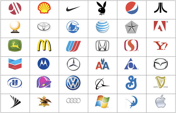
For example, if you were a car enthusiast, then you would be able to name all the car logos in the above table. However, if you did not drive a car or watch commercial television or read car ads in print media, you might be familiar with only the most "popular" logos (i.e., the ones that cannot be avoided because their signage is everywhere you look). We make the assumption that everyone falls somewhere between these two extremes along a consumption continuum and assess whether we can reproduce every individual pattern of answers based solely on their location on this single dimension. Shopping intensity or consumerism is the path, and logo identifications are the sensors along that path.

Specifically, if some number of N respondents played this game, it would not be difficult to rank order the 36 logos in the above table along a line stretching from 0% to 100% correct identification. Next, we examine each respondent, starting by sorting the players from those with the fewest correct identifications to those getting the most right. As shown in an earlier post, a heatmap will reveal the relationship between the ease of identifying each logo and the overall logo knowledge for each individual, as measured by their total score over all the brand logos. [The R code required to simulate the data and produce the heatmap can be found at the end of this post.]

You can begin by noting that blue is correct and red is not. Thus, the least knowledgeable players are in the top rows filled with the most red and the least blue. The logos along the x-axis are sorted by difficulty with the hardest to name on the left and the easiest on the right. In general, better players tend to know the harder logos. This is shown by the formation of a blue triangle as one scans towards the lower, right-hand corner. We call this a Guttman scale, and it suggests that both variation among the logos and the players can be described by a single dimension, which we might call logo familiarity or brand presence. However, one must be wary of suggestive names like "brand presence" for over time we forget that we are only measuring logo familiarity and not something more impactful.

Our psychometrician might have analyzed this same data using the R package ltm for latent trait modeling. A hopefully intuitive introduction to item response modeling was posted earlier on this blog. Those results could be summarized with a series of item characteristic curves displaying the relationship between the probability of answering correctly and the underlying trait, labeled ability by default.

As you see in the above plot, the items are arranged from the easiest (V1) to the hardest (V36) with the likelihood of naming the logo increasing as a logistic function of the unobserved consumerism measured as z-scores and called ability because item response theory (IRT) originated in achievement testing. These curves are simple to read and understand. A player with low consumption (e.g., a z-score near -2) has a better than even chance of identifying the most popular logos, but almost zero probability of naming any of the least familiar logos. All those probabilities move up their respective S-curves together as consumers become more involved.

In this example the function has been specified for I have plotted the item characteristics curves from the one-parameter Rasch model. However, a specific functional form is not required, and we could have used the R package KernSmoothIRT to fit a nonparametric model. The topology remains a unidimensional manifold, something similar to Hastie's principal curve in the R package princurve. Because the term has multiple meanings, I should note that I am using "topology" in a limited sense in order to refer to the shape of the data and not as in topological data analysis.

To be clear, there must be powerful forces at work to constrain logo naming to a one-dimensional continuum. Sequential skills that build on earlier achievements can often be described by a low-dimensional manifold (e.g., learning descriptive statistics before attempting inference since the latter assumes knowledge of the former). We would have needed a different model had our brands been local so that higher shopping intensity would have produced greater familiarity only for those logos available in a given locality (e.g., country-specific brands without an international presence).


The Meaning of Brand Familiarity Depends on Brand Presence in Local Markets

Now, it gets interesting. We started with players differentiated by a single parameter indicating how far they had traveled along a common consumption path. The path markers or sensors are the logos arrayed in decreasing popularity. Everyone shares a common environment with similar exposures to the same brand logos. Most have seen the McDonald's double-arcing M or the Nike swoosh because both brands have spent a considerable amount of money to buy market presence. On the other hand, Hilton's "blue H in the swirl" with less market presence would be recognized less often (fourth row and first column in the above brand logo table).

But what if market presence and thus logo popularity depended on your local neighborhood? Even international companies have differential presence in different countries, as well as varying concentration within the same country. Spending and distribution patterns by national, regional and local brands create clusters of differential market presence. Everyone does not share a common logo exposure so that each cluster requires its own brand list. That is, consumers reside in localities with varying degrees of brand presence so that two individuals with identical levels of consumption intensity or consumerism would not be familiar with the same brand logos. Consequently, we need to add a second parameter to each individual's position along a path specific to their neighborhood. The psychometrician calls this differential item functioning (DIF), and R provides a number of ways of handling the additional mixture parameter.


Overlapping Audiences in the Marketplace of Attention

You may have anticipated the next step as the topology becomes more complex. We began with one pathway marked with brand logos as our sensors. Then, we argued for a mixture model with groups of individuals living in different neighborhoods with different ordering of the brand logos. Finally, we will end by allowing consumers to belong to more than one neighborhood with whatever degree of belonging they desire. We are describing the kind of fragmentation that occurs when consumers seize control and there is more available to them than they can attend to or consider. James Webster outlines this process of audience formation in his book The Marketplace of Attention.

The topology has changed again. There are just too many brand logos, and unless it becomes a competitive game, consumers will derive diminishing returns from continuing search and they typically will stop sooner rather than later. It helps that the market comes preorganized by providers trying to make the sale. Expert reviews and word of mouth guide the search. Yet, it is the consumer who decides what to select from the seemingly endless buffet. In the process, an individual will see and remember only a subset of all possible brand logos. We need a new model - one that simultaneously sorts both rows and columns by grouping together consumers and the brand logos that they are likely to recognize.

A heatmap may help to explain what can be accomplished when we search for joint clusterings of the rows and columns (also known as biclustering). Using an R package for nonnegative matrix factorization (NMF), I will simulate a data set with such a structure and show you the heatmap. Actually, I will display two heatmaps, one without noise so that you can see the pattern and a second with the same pattern but with added noise. Hopefully, the heatmap without noise will enable you to see the same pattern in the second heatmap with additional distortions.


I kept the number of columns at 36 for comparison with the first one-dimensional heatmap that you saw toward the beginning of this post. As before, blue is one, and red is zero. We discover enclaves or silos in the first heatmap without noise (polarization). The boundaries become fuzzier with random variation (fragmentation). I should note that you can see the biclusters in both heatmaps without reordering the rows and columns only because this is how the simulator generates the data. If you wish to see how this can be done with actual data, I have provided a set of links with the code needed to run a NMF in R at the end of my post on Brand and Product Category Representation.

Finally, although we speak of NMF as a form of simultaneous clustering, the cluster membership are graded rather than all-or-none (soft vs. hard clustering). This yields a very flexible and expressive topology, which becomes clear when we review the three alternative representations presented in this post. First, we saw how some highly structured data matrices can be reproduced using a single dimension with rows and columns both located on the same continuum (IRT). Next, we asked if there might be discrete groups of rows with each row cluster having its own unique ordering of the columns (mixed IRT). Lastly, we sought a model of audience formation with rows and columns jointly collected together into blocks with graded membership for both the rows and the columns (NMF).

Knowledge is organized as a single dimension when learning is formalized within a curriculum (e.g., a course at an educational institution) or accumulative (e.g., need to know addition before one can learn multiplication). However, coevolving networks of customers and products cannot be described by any one dimension or even a finite mixture of different dimensions. The Internet creates both microgenres and fragmented audiences that require their own topology.

R Code to Produce Figures in this Post

# use psych package to simulate latent trait data
library(psych)
logos<-sim.irt(nvar=36, n=500, mod="logistic")
 
# Sort data by both item mean
# and person total score
item<-apply(logos$items,2,mean)
person<-apply(logos$items,1,sum)
logos$itemsOrd<-logos$items[order(person),order(item)]
 
# create heatmap
# may need to increase size of plots window in R studio
library(gplots)
heatmap.2(logos$itemsOrd, Rowv=FALSE, Colv=FALSE, 
          dendrogram="none", col=redblue(16), 
          key=T, keysize=1.5, density.info="none", 
          trace="none", labRow=NA)
 
library(ltm)
# two-parameter logistic model
fit<-ltm(logos$items ~ z1)
summary(fit)
 
# item characteristic curves
plot(fit)
 
# constrains slopes to be equal
fit2<-rasch(logos$items)
plot(fit2)
summary(fit2)      
 
library(NMF)
# generate a synthetic dataset with 
# 500 rows and three groupings of
# columns (1-10, 11-20, and 21-36)
n <- 500
counts <- c(10, 10, 16)
 
# no noise
V1 <- syntheticNMF(n, counts, noise=FALSE)
V1[V1>0]<-1
 
# with noise
V2 <- syntheticNMF(n, counts)
V2[V2>0]<-1
 
# produce heatmap with and without noise
heatmap.2(V1, Rowv=FALSE, Colv=FALSE, 
          dendrogram="none", col=redblue(16), 
          key=T, keysize=1.5, density.info="none", 
          trace="none", labRow=NA)
heatmap.2(V2, Rowv=FALSE, Colv=FALSE, 
          dendrogram="none", col=redblue(16), 
          key=T, keysize=1.5, density.info="none", 
          trace="none", labRow=NA)
Created by Pretty R at inside-R.org

Wednesday, December 2, 2015

The Statistician as Data Action Hero

"If our goal as a field is to use data to solve problems, then we need to move away from exclusive dependence on data models and adopt a more diverse set of tools."
Leo Breiman

Breiman ends the opening abstract of his "manifesto" to the statistical community with the above call to action. As a statistics professor at Berkeley, he was not an outsider.

Unfortunately, the warning was not heeded and now statistics laments with the President of the American Statistical Association asking "Aren't We Data Science?". Interestingly, one of the comments objects to a suggestion in this editorial that statisticians ought to learn R.

Clearly, someone has missed the point. It is not what you call yourself, who signs your paycheck, or the size of your data sets. It is your openness to disruptive innovation and your desire to make a difference. R provides the interface that makes this possible.

Breiman states it well at the end of an interview from 2001,
So I think if I were advising a young person today, I would have some reservations about advising him or her to go into statistics, but probably, in the end, I would say, “Take statistics, but remember that the great adventure of statistics is in gathering and using data to solve interesting and important real world problems.”

Tuesday, November 24, 2015

Statistical Models That Support Design Thinking: Driver Analysis vs. Partial Correlation Networks

We have been talking about design thinking in marketing since Tim Brown's Harvard Business Review article in 2008. It might be easy for the data scientist to dismiss the approach as merely a type of brainstorming for new products or services. Yet, design issues do arise in data visualization where we are concerned with communicating our findings. However, my interest is model selection: Should the analyst select one statistical model over another because the user might find it more helpful in planning interventions or designing new products and services?

For example, the marketing manager who wants to retain current customers seeks guidance from customer satisfaction questionnaires filled with performance ratings and intentions to recommend or purchase again. Motivated by the desire to keep it simple, common practice tends to focus attention on only the most important "causes" of customer retention. As I noted in my first post, Network Visualization of Key Driver Analysis, a more complete picture can be revealed by a correlation graph displaying all the interconnections among all the ratings. The edges or links are colored green or red so that we know if the relationship is positive or negative. The thickest of the path indicates the strength of the correlation. But correlations measure total effects, both those that are direct and those obtained through associations with other ratings.

The designer of intervention strategies aimed at preventing churn could acquire additional insights from the partial correlation graph depicting the effects between all pairs of ratings controlling for all the other ratings in the model. While the correlation map reveals total effects, the partial correlation map removes all but the direct effects. The graph below was created using the R code from my first post to simulate a data set that mimics what is often found when airline passengers complete satisfaction surveys. Once the data were generated, the procedures outlined in my post Undirected Graphs When the Causality is Mutual were followed. The R code is listed at the end of this discussion.


We can pick any node, such as the one labeled "Satisfaction" in the middle of the right-hand side of the figure. A simple way of interpreting this graph is to think of Satisfaction as the dependent variable and the lines radiating from Satisfaction as the weights obtained from the regression of this node on the other 14 ratings. Clearly, overall satisfaction serves as an inclusive summary measure with so many pathways from so many other nodes. Each of the four customer service ratings (below Satisfaction and in light pink) adds its own unique contribution with the greatest impact indicated by the thickest green edge from the Service node. Moreover, Easy Reservation and Ticket Price plus Clean Aircraft with room for people and baggage make incremental improvements in Satisfaction.

The same process can be repeated for any node. Instead of a driver analysis that narrows our thinking to a single dependent variable and its highest regression weights, the partial correlation map opens us to the possibilities. If the goal was customer retention, then the focus would be on the Fly Again node. Recommend seems to have the strongest link to Fly Again. Can the airline induce repeat purchase by encouraging recommendation? What if frequent flyer miles were offered when others entered your name as a recommender? Such a proposal may not be practical in its current form, but the graph supports this type of design thinking.

Because there are no direct paths from the four service nodes to Fly Again, a driver analysis would miss the indirect connection through Satisfaction. And what of this link between Courtesy and Easy Reservation? Do customers infer a "friendly" personality trait that links their perceptions of the way they are treated when they buy a ticket and when they board the plane? Design thinkers would entertain such a possibility and test the hypothesis. Such "cascaded inferences" fill the graph for those willing to look. Perhaps many small and less costly improvements might combine to have a greater impact than concentrating on a single aspect? Encouraging passengers to check their bags would create more overhead storage without reconfiguring the airplane. Let the design thinking begin!

The discussion ends with the identification of "the most important" in a driver analysis. The network, on the other hand, invites creative thought. Isn't this the point of data science? What can we learn from the data? The answer is a good deal more than can be revealed by the largest coefficient in a single regression equation.

# Calculates Sparse Partial Correlation Matrix
sparse_matrix<-EBICglasso(cor(ratings), n=1000)
round(sparse_matrix,2)
 
# Plots results
gr<-list(1:4,5:8,9:12,13:15)
node_color<-c("lightgoldenrod","lightgreen","lightpink","cyan")
qgraph(sparse_matrix, fade = FALSE, layout="spring", groups=gr, 
       color=node_color,labels=names(ratings), label.scale=FALSE, 
       label.cex=1, node.width=.5, edge.width=.25, minimum=.05)
Created by Pretty R at inside-R.org

Sunday, November 8, 2015

Mutually Exclusive Clusters Are Boxes within Which Consumers No Longer Fit

Sometimes we force our categories to be mutually exclusive and exhaustive even as the boundaries are blurring rapidly.


Of course, I am speaking of cluster analysis and whether it makes sense to force everyone into one and only one of a set of discrete boxes. Diversity is diverse and requires a more expressive representation than possible in a game of twenty questions. "Is it this or that?" is inadequate when it is a little of this and a lot of that.

How do you classify a love seat? Is it a small sofa or a large chair for two people? Natural categories are not defined by all-or-none criteria. All birds do not possess the same degree of "birdness" (as shown below for the graded structure underlying the classification of birds). Some birds are more "bird" than other birds, and some mammals might be thought of as birds (bats) because they look and behave more like birds than typical mammals.

In an earlier post, I issued a warning that clusters may appear more separated in textbooks than in practice. I urged that we consider other representations for individual variation. Archetypes work because they reside at the periphery of the objects to be described with all the other species in-between (e.g., birds of prey, household pets in cages, winter migrants, evil dark birds, and white birds of peace). In marketing this is the realm of fans, fanatics and -philes in which it is so easy to visualize the extreme users and name everyone else as hybrid combinations of pure types. R makes the analysis doable. Moreover, with dimensions defined as contrasting ideals (liberal vs. conservative), archetypal analysis mimics hidden dimensions such as those from factor analysis and item response theory.

The Forces behind Diversity Do Not Yield Disjoint Clusters

I have found it best to begin with the forces generating diversity. Why doesn't one size fit all? As a marketer, I look toward consumer demand - whether it originates out of individual usage, preference or need or whether it is manufactured by providers introducing new products and services. I discover that demand is seldom contained within a single box. Some cable television viewers want to watch lots of sports, so let us place them in the sport segment. But they also want movies-on-demand, so we need four segments filling in the 2x2 for sports and movies-on-demand. Hopefully, they do not want to hear the business news because now we have 8 segments in our 2x2x2. As the consumer acquires greater control, the old segmentation scheme seems more and more forced as if we are holding onto a simpler world with everyone crammed into one of only a few silos.

Recommendation systems adopt a different metaphor with the marketplace partitioned by user collaboration and the chunking of offerings into micro-genres. Heterogeneity is seen as coevolving networks of consumers and what they buy. A handful of mutually exclusive boxes will not work in a market that is increasingly fragmenting.

When there are so many alternatives within easy reach of the internet, no consumer can attend to it all. The rows in our data matrix, each containing information from a single individual, become both longer with more options and sparser with limited attention. If we want to play in the marketplace of attention, we will need more than K-means or finite mixture models. Researchers will require even more - the type of easy access provided by R packages such as archetype and NMF.

With the appropriate statistical model, one can uncover such generating processes from the data matrix with consumers as rows and what they want or like in the columns. Using figurative language I have called this approach the "ecology of data matrices" and have suggested the need for biclustering. Yet, there is opposition since we are so accustomed to dividing the analysis of rows and columns into two separate procedures. Most cluster analyses input all the columns to calculate distances among the rows. Factor analysis starts with column correlations computed from data including every row. Biclustering, on the other hand, cares about sorting the cells into simultaneous groupings of row-column combinations. The data matrix gets divided into subspaces, possibly overlapping, with this community of consumers similar on only those groupings of variables.

The simplicity of boxes will not work with consumers in control and more available than any one buyer can attend to or know about. An underlying structure remains, but one defined by the joint interaction of rows and columns. Consumers with common needs and experiences are attract to the same purchase channels and learn about offerings from the same sources. This simultaneous clustering of rows and columns are the blocks from which consumers customized their own personal consumption patterns. Nothing forces the consumer to select only one building block. In fact, the opposite is more generally true for most of us play multiple roles (e.g., items purchased for work and play, self and others, necessities and gifts, and the list goes on). To capture such common practices, we need a clustering technique that does not impose a simplistic representation forcing consumers into boxes within which they no longer fit.

Sunday, November 1, 2015

Clustering Customer Satisfaction Ratings

We run our cluster analysis with great expectations, hoping to uncover diverse segments with contrasting likes and dislikes of the brands they use. Instead, too often, our K-means analysis returns the above graph of parallel lines indicating that the pattern of high and low ratings are the same for everyone but at different overall levels. The data come from the R package semPLS and look very much like what one sees with many customer satisfaction surveys.

I will not cover any specifics about the data, but instead refer you to earlier discussions of this dataset, first in a post showing its strong one-dimensional structure using biplots and later in an example of an undirected graph or Markov network displaying brand associations.

We will begin with the mean ratings for the four lines in the above graph and include a relatively small fifth segment in the last column with a different narrative. Ordering the 23 items from lowest to highest mean scores over the entire sample makes both the table below and the graph above easier to read.

not at all
a little
some
a lot
pricey
9%
27%
34%
21%
10%
FairPrice
4.1
5.1
6.4
8.2
5.6
BuyAgain
3.0
6.9
8.7
9.7
3.8
Responsible
4.3
6.2
6.9
8.1
7.0
GoodValue
4.8
5.7
7.3
8.6
7.0
ComplaintHandling
4.4
6.1
7.2
8.9
7.8
Fulfilled
4.8
6.0
7.5
8.6
7.8
IsIdeal
4.6
6.2
7.7
9.0
7.8
NetworkQuality
5.6
6.2
7.4
8.4
8.0
Recommend
3.8
6.7
8.4
9.6
7.2
ClearInfo
4.6
6.5
7.9
9.2
8.6
Concerned
5.3
6.4
8.1
9.0
8.1
QualityExp
6.0
7.1
7.6
8.6
7.9
CustomerService
4.8
6.7
8.0
9.3
8.5
MeetNeedsExp
6.1
7.1
7.3
8.7
8.4
GoWrongExp
7.0
6.2
7.5
8.5
8.5
Trusted
6.1
6.6
7.8
9.1
8.4
Innovative
5.8
7.4
8.1
9.2
8.2
Reliability
6.1
6.8
7.9
9.2
8.7
RangeProdServ
6.2
7.1
8.0
9.2
8.3
Stable
7.1
6.7
7.8
9.1
8.3
OverallQuality
6.3
7.0
8.2
9.2
8.5
ServiceQuality
6.3
7.1
7.9
9.4
8.6
OverallSat
6.4
7.3
8.2
8.9
8.7

You can pick any row in this table and see that the first four segments with 90% of the customers are ordered the same. The first cluster is simply not at all happy with their mobile phone provider. They give the lowest Buy Again and Recommend ratings. In fact, with only two small exceptions, they uniformly give the lowest scores. For every row the second column is larger (note the two discrepancies already mentioned), followed by an even bigger third column, and then the most favorable fourth column. Successful brands have loyal customers, and at least one out of five customers in this data have "a lot" of love with a mean ratings of 9.7 on a 10-point scale.

You can see why I labeled these four segments with names suggesting differing levels of attraction. Each group has the same profile, as can be seen in the largely parallel lines on our graph. The good news for our providers is that only 9% are definitely at risk. The bad news is that another 10% like the product and the service but will not buy again, perhaps because the price is not perceived as fair (see their graph below with a dip for the second variable, Buy Again, and a much lower score than expected for the first variable, Fair Price, given the elevation of the rest of the curve).


Some might argue that what we are seeing is merely a measurement bias reflecting a propensity among raters to use different portions of the scale. Does this mean that 90% of the customers have identical experiences but give different ratings due to some scale-usage predisposition? If it is a personality trait, does this mean that they use the same range of scale values to rate every brand and every product? Would we have seen individuals using the same narrow range of scores had the items been more specific and more likely to show variation, for example, if they had asked about dropped calls and dead zones rather than network quality?

Given questions without any concrete referent, the uniform patterns of high and low ratings across the items are shaped by a network of interconnected perceptions resulting from a common technology and a shared usage of that technology. In addition, one overhears a good deal of discussion about the product category in the media and from word-of-mouth so that even a nonuser might be aware of the pros and cons. As a result, we tend to find a common ordering of ratings with some customers loving it all "a lot" and others "not at all." Unless customers can provide a narrative (e.g., "I like the product and service, but it costs too much"), they will all reproduce the same profile of strengths and weaknesses at varying levels of overall happiness. That is, satisfied or not, almost everyone seems to rate value and price fairness lower than they score overall quality and satisfaction.

Finally, my two prior posts cited earlier may seem to paint a somewhat contradictory picture of customer satisfaction ratings. On the one hand, we are likely to find a strong first principal component indicating the presence of a single dimension underlying all the ratings. Customer satisfaction tends to be one-dimensional so that we might expect to observe the four clusters with parallel lines of ratings. Satisfaction falls for everyone as features and services become more difficult for any brand to deliver. On the other hand, the graph of the partial correlations suggests a network of interconnected pairs of ratings after controlling for the all the remaining items. One can identify regions with stronger relationships among items measuring quality, product offering, corporate citizenship, and loyalty.

Both appear to be true. Rating with the highest partial intercorrelations form local neighborhoods with thicker edges in our undirected graph. Although some nodes are more closely related, all the variables are still connected either directly with a pairwise edge or indirectly through a separating node. Everything is correlated, but some are more correlated than others.

R code needed to reproduce these tables and plots.

library("semPLS")
data(mobi)
 
# descriptive names for graph nodes
names(mobi)<-c("QualityExp",
               "MeetNeedsExp",
               "GoWrongExp",
               "OverallSat",
               "Fulfilled",
               "IsIdeal",
               "ComplaintHandling",
               "BuyAgain",
               "SwitchForPrice",
               "Recommend",
               "Trusted",
               "Stable",
               "Responsible",
               "Concerned",
               "Innovative",
               "OverallQuality",
               "NetworkQuality",
               "CustomerService",
               "ServiceQuality",
               "RangeProdServ",
               "Reliability",
               "ClearInfo",
               "FairPrice",
               "GoodValue")
 
# kmeans with 5 cluster and 25 random starts
kcl5<-kmeans(mobi[,-9], 5, nstart=25)
 
# cluster profiles and sizes
cluster_profile<-t(kcl5$centers)
cluster_size<-kcl5$size
 
# row and column means
row_mean<-apply(cluster_profile, 1, mean)
col_mean<-apply(cluster_profile, 2, mean)
 
# Cluster profiles ordered by row means
# columns sorted so that 1-4 are increasing means
# and the last column has low only for buyagain & fairprice
# Warning: random start values likely to yield different order
sorted_profile<-cluster_profile[order(row_mean),c(4,3,1,2,5)]
 
# reordered cluster sizes and profiles
cluster_size[c(4,3,1,2,5)]/250
round(sorted_profile,2)
 
# plots for first 4 clusters
matplot(sorted_profile[,-5], type = c("b"), pch="*", lwd=3,
        xlab="23 Brand Ratings Ordered by Average for Total Sample",
        ylab="Average Ratings for Each Cluster")
title("Loves Me Little, Some, A Lot, Not At All")
 
# plot of last cluster
matplot(sorted_profile[,5], type = c("b"), pch="*", lwd=3,
        xlab="23 Brand Ratings Ordered by Average for Total Sample",
        ylab="Average Ratings for Last Cluster")
title("Got to Switch, Costs Too Much")
Created by Pretty R at inside-R.org